Firmaların, zaman zaman yeni kan ihtiyacına yönelik logoları üzerinde değişimleri zar zor kabullenirken, dünya üzerinde toplu yemek, bina yönetimi ve yemek çekleri üretiminde lider bir firma çattt diye hem logosunu hem de ismini değiştirdi.
Sodexho’nun (pardon o artık Sodexo:) bu radikal kararı hakkında ayrıntılı bilgiyi aşağıdaki linkten edinebilirsiniz.
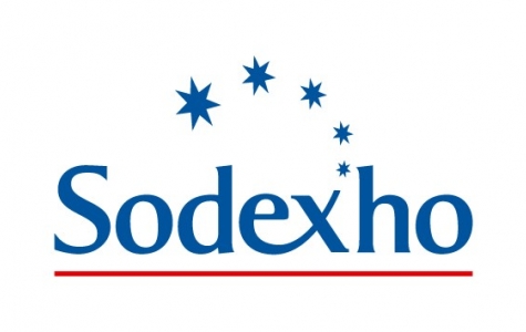
Sodexho açılımı Societé d’Exploitation Hotelière’tir (Meali Otel Hizmetleri Şirketi). Şirket önce Alliance ile bir evlilik yaptı ve Sodexho Alliance olarak anıldı daha sonralarında da Sodexho Marriott Services ve SodexhoMagic (burdaki Magic Magic Johnson’un kurduğu Magic Food Provisions şirketidir.) şirketleri ile evlilik yaparak onların isimlerini eklemiş olsa da zamanla bu isimleri bünyesinde eriterek Sodexho olarak yoluna devam etti, sonrasında ne yapsak ne etsek de kafaları karıştırsak diye düşünürken (yönetim kurulunda bir trakya asıllı bir yönetici olduğundan şüphelenmekteyim) Sodexho 2008 itibariyle Sodexo olarak anılacaktır.
Yeni logonun fontu bana facebook’u çağrıştırmadı desem yalan olur. Toplu yemek üretirken bina yönetimi hizmetine adım atan firma için daha teknik görünümlü bir logo (bu da nasıl tanımsa, olsun halk böyle istiyor) olmalıydı.
linke bakmaya üşenenler için ön özet aşağıdadır:)
Three major changes have been made as part of the brand evolution:
The word ‘Alliance’; has been dropped from the company’s legal name to accelerate the deployment of Sodexo’s single global brand strategy throughout its operations, business segments and host countries.
The letter ‘h’; has been deleted from the name to support the Group’s strategic transformation into a Services company. Because the ‘h’; is often associated with the hotel and foodservices business, particularly in Europe, the change emphasizes the Group’s accelerating development in Facilities Management services. In addition to increasing the brand’s scope and impact, the simpler, more dynamic name has been found to be easier to pronounce and spell for people around the world.
The logo has been streamlined and given a more contemporary graphic design that rejuvenates and revitalizes the brand. The typography is simpler, livelier and more compact. The star, long part of the Group’s visual identity, has been transformed from five stars to one. The single star symbolizes the performance and energy of Sodexo teams directed toward a common objective. This star differs from other stars, just as Sodexo stands out from its competitors. Finally, the bar of the letter ‘x’; is curved, like a smile-a red streak reaching upwards toward the Sodexo star and a symbol of the countless gestures of attention performed daily by Sodexo teams to ‘make every day a better day.’;